
Devlog #5 — Football Legends: My UI Builder Workflow
Before starting development on Football Legends, I hadn’t worked with Unity’s newer UI system (UI Toolkit / UI Builder), and to be honest, I was pretty sceptical about switching from the classic Unity UI workflow.
I had always found the traditional approach very intuitive: a Canvas in the scene rendered over the camera, a hierarchy of child elements, enabling and disabling GameObjects, wiring up events visually… If you’ve used Unity UI before, you know exactly what I mean — it was straightforward and easy to reason about.
Because of that, my first attempts with UI Builder were honestly quite confusing.
What exactly are UIDocuments?
Why am I working with files that look like XML and CSS?
Am I building a game UI… or a web page? 😅
Looking back, I was definitely being stubborn. Most of my concerns weren’t really about the system itself, but about switching to a completely different workflow.
Now, after working with it in Football Legends, I can confidently say UI Toolkit is extremely flexible and especially powerful for complex interfaces. More importantly, it adapts incredibly well to different screen sizes and devices — which is absolutely critical for Football Legends’ mobile UI.
How I Learned to Work With UI Builder
My approach was simple: take it slow and build things step by step. This is especially important in a project like Football Legends, where the interface is responsible for presenting a large amount of data to the player.
Step 1 — Designing the UI Outside Unity
The first thing I did was design the UI layout using an external tool. It may sound obvious, but this step is easy to underestimate.
Jumping straight into Unity and creating UI elements without a clear design usually leads to messy layouts and constant rework. Having a defined structure beforehand saves a huge amount of time and frustration.
In my case, I used Illustrator, but the specific tool doesn’t really matter. The important part is the mindset.
One tip that helped me a lot:
Think in relative sizes, not absolute pixels.
For example, if you need a menu on the left side of the screen, think of it as a percentage of the total width instead of “exactly 300 pixels”.
This approach makes UI Builder implementation much smoother and ensures the layout scales properly across different resolutions. Honestly, I wish I had fully understood this before starting.
For smaller elements like icons or buttons, this approach isn’t always practical. However, for main layout zones like panels, menus, and content areas, it fits perfectly with how UI Toolkit handles nested containers and flexible layouts.
Step 2 — Building the UI in UI Builder
This is where the real Unity work begins, and there are several things that are worth setting up properly from the start.
Shortcuts and Workflow Ergonomics
The very first thing I strongly recommend doing is assigning a keyboard shortcut to open UI Builder.
Path:
Edit → Shortcuts → MainMenu / Window / UI Toolkit / UI Builder
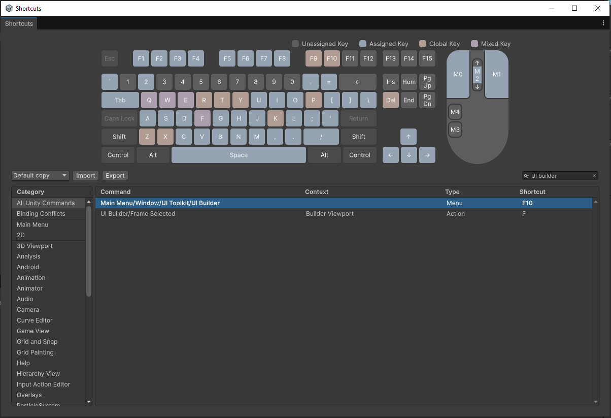
Just search for “UI Builder” and you’ll find it quickly.
Don’t overthink it. Just assign one.
I personally mapped it to F10.
Opening and closing UI Builder through menus constantly becomes extremely disruptive and breaks your workflow. A shortcut makes working with UI Toolkit significantly smoother.
Separating Structure and Styling (Very Important)
One of the core concepts behind UI Toolkit is separating layout structure from visual styling.
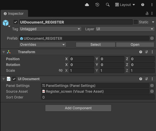
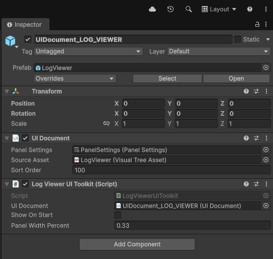
The root object for any UI in UI Toolkit is the UIDocument, which acts as the container for your interface. In practice, it’s simply a GameObject with a UIDocument component attached. You can use one or multiple UIDocuments depending on your UI architecture.
In Football Legends, I use one UIDocument for the main interface and another for a custom debug UI.
When working with UIDocuments, you’ll typically deal with two types of files:
- .uxml → UI structure
- .uss → Visual styles
The .uxml file defines the hierarchy and layout of the UI: which elements exist, how they are nested, and how they relate to each other. Ideally, this file should not contain styling information like colors, fonts, or images. This is the file referenced by the UIDocument component to render the interface.
Visual appearance should be defined in .uss files, which work very similarly to CSS style sheets in web development. These files define colors, typography, background images, animations (although I’m still experimenting with animation workflows), and other visual aspects.
My recommendation here is very clear:
Start using multiple USS files from the beginning.
Splitting styles by feature, UI section, or theme will save you a lot of maintenance headaches later.
Avoiding Inline Style Chaos
This was one of the most confusing parts when I first started using UI Builder.
When you modify elements directly in the visual editor, Unity automatically creates inline styles inside the .uxml file. This is great for prototyping, but it quickly becomes messy if you don’t manage it properly.
After rebuilding my styles several times 😅, this is the workflow that worked best for me:
- Add the element to an existing container (for example, a button).
- Adjust its appearance using the visual editor until you’re satisfied.
- Extract the inline styles into a .uss file
(make sure you know which USS file is currently active). - From that point on, stop modifying that element visually and edit the USS file directly. The official documentation explains this process very well.
From then on, all visual changes should be handled in USS files.
Why?
Because continuing to tweak elements in the visual editor leads to styles being split between .uxml and .uss. Also, inline styles defined in .uxml take priority, which can create extremely confusing and hard-to-debug behaviour.
Organising Style Files
Once styles are extracted into USS files, organising them properly becomes very important as the UI grows.
When you extract styles from inline definitions, Unity places every property into a single style block. That includes layout behaviour, alignment, colors, fonts… everything. This quickly becomes hard to maintain in larger projects.
What worked best for me was separating styles into two main categories:
Layout / Behaviour Styles
- Size
- Alignment
- Flex layout
- Positioning
Pure Visual Styles
- Colors
- Typography
- Background images
- Visual themes
Currently, Football Legends uses four main USS files:
• A global layout file containing reusable layout patterns like 33/66 splits or 50/50 panels.
Think of this as layout templates for distributing screen space.
• A structural components file containing specific UI element layouts (language selector, forms, specific buttons, country selector, etc.).
• A dark theme style sheet.
• A light theme style sheet.
This separation allows me to work independently on layout architecture, reusable UI components, and visual themes. It’s not mandatory, but for a data-heavy interface like Football Legends, it helps keep everything manageable.
If you’re planning to support light/dark themes, separating theme files is practically essential.
Step 3 — Programming UI Behaviour
At this stage in Football Legends’ UI workflow, everything looks correct visually… but nothing actually works yet.
This part becomes highly project-specific, so I’ll explain my approach using the user registration flow as an example.
Some UI elements only need to trigger actions when interacted with (like a “Continue with Google” button). These elements usually don’t require complex internal logic — they simply trigger external processes.
Other elements require custom behaviour. A good example is the language selector.
This selector contains:
- Main container
- Selected language button
- Background image
- Available language icons
Its .uxml structure looks like this:
<ui:VisualElement name="language-block" picking-mode="Ignore" class="language-block">

    <ui:VisualElement name="language-button" picking-mode="Ignore" class="language-button">

        <ui:Image name="language-flag-current" picking-mode="Ignore" class="language-flag-current flag-en"/>

    </ui:VisualElement>

    <ui:VisualElement name="language-dropdown" picking-mode="Ignore" class="language-dropdown language-dropdown-image">

        <ui:Image name="es" class="flag-option flag-es"/>

        <ui:Image name="fr" class="flag-option flag-fr"/>

        <ui:Image name="de" class="flag-option flag-de"/>

        <ui:Image name="it" class="flag-option flag-it"/>

        <ui:Image name="pt" class="flag-option flag-pt"/>

        <ui:Image name="ne" class="flag-option flag-ne"/>

        <ui:Image name="jp" class="flag-option flag-jp"/>

    </ui:VisualElement>

</ui:VisualElement>
The expected behaviour is more complex:
- Clicking opens the dropdown
- Selecting a language swaps icons
- All UI text updates dynamically
- The user preference is saved
- The dropdown closes automatically
- Clicking outside closes it as well
This required creating a dedicated system responsible for this component, which also integrates with the game’s localisation system.
I won’t go into implementation details here, but the key takeaway is:
Complex UI elements usually require their own behaviour logic.
One important technical note: be very careful with picking modes when building UI Toolkit elements. They are essential for controlling interactivity. In my experience, defining picking behaviour explicitly in code has been far more reliable than relying purely on visual setup.
Step 4 — A Central Manager That Coordinates Everything
The final step in Football Legends was creating a central UI flow manager that orchestrates the entire process (in this case, the user registration flow).
This manager is responsible for:
- Deciding which UI elements are visible at any moment
- Listening to events from different controls
- Coordinating overall UI flow
Importantly, this manager does not handle the internal logic of individual UI components. Each element remains responsible for its own behaviour.
Conclusion
After implementing UI Toolkit in Football Legends, I wouldn’t describe UI Builder as a “magic” solution, and it definitely wasn’t intuitive at first.
However, once you understand its core concepts and adopt a structured workflow, it becomes a very powerful and surprisingly enjoyable tool to work with — especially for complex, scalable, and multi-resolution UI systems.